Building user-friendly web applications often means providing extra information without cluttering the interface. A great way to do this is by using info popups or tooltips. These are small pieces of content that appear when a user interacts with a certain element. In this article, we will explore how to dynamically attach info popups using JavaScript popovers.
JavaScript Popovers are temporary view elements that display content related to interface elements. Unlike tooltips that provide minimal context, popovers can offer rich descriptive content, including more extensive texts, images, and even interactive elements like forms. We will focus on how to attach and handle these dynamically.
1. Basic Setup
Before you can add a popover, you need to ensure you have the necessary HTML structure. Here's a simple example:
<button id="infoButton">More Info</button>This button will act as the trigger for our popover.
2. Styling Popovers with CSS
Although CSS isn't directly related to the dynamic attachment, it's helpful for positioning and visibility. Here’s a basic style to make popovers look better:
.popover {
  position: absolute;
  visibility: hidden;
  background-color: #fff;
  border: 1px solid #ccc;
  padding: 10px;
  box-shadow: 0 2px 4px rgba(0,0,0,0.1);
  z-index: 10;
}

.popover.show {
  visibility: visible;
}
This CSS class `.popover` will hold our content, and the `.show` class will manage its visibility.
3. Creating Popovers with JavaScript
The JavaScript part involves creating a popover element and controlling its display. Here’s a basic example of how you can achieve this:
document.getElementById('infoButton').addEventListener('click', () => {
  const existingPopover = document.querySelector('.popover');
  if (existingPopover) {
    existingPopover.remove();
  } else {
    const popover = document.createElement('div');
    popover.className = 'popover show';
    popover.innerHTML = '<p>This is a dynamically generated popover!</p> <a href="#">Learn more</a>';
    document.body.appendChild(popover);
    const rect = document.getElementById('infoButton').getBoundingClientRect();
    popover.style.left = `${rect.left + window.scrollX}px`;
    popover.style.top = `${rect.top + window.scrollY + rect.height}px`;
  }
});
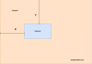
In this example, we first check if a popover already exists. If it does, it means it's currently shown, so we remove it. Otherwise, we create a new div element with the class `.popover` and insert it into the document. We adjust its position to be relative to the button using the `getBoundingClientRect` method to fetch its geometric properties.
4. Enhancements and Best Practices
To enhance this setup, consider the following:
- Use an external library, like Bootstrap or Popper.js, to simplify hover-based popovers and manage complex positioning.
- Incorporate accessibility standards, such as keyboard navigation and screen reader support, by adding `aria-*` attributes.
- Handle auto-closure by setting a timeout function or letting it close when users click elsewhere.
5. Conclusion
By harnessing the capabilities of JavaScript to manage DOM elements, we can effectively create dynamic popovers that improve user interaction with minimal performance overhead. As web applications grow increasingly complex, such small enhancements can greatly enhance the user experience. Experiment with various styles and behaviors to suit your project's needs, and always remember to keep performance and accessibility in mind.
Dynamic JavaScript popovers bridge the gap between simplistic tooltips and full-modal dialogues, offering a middle ground that is user-friendly and rich in content. With the tutorial provided, you should be able to implement these as needed within your web projects.

