The Popover API in JavaScript is a powerful feature designed to improve the user experience by providing additional contextual information through pop-up messages on a web page. This capability is especially useful in creating interactive tours, tooltips, and help messages that guide users effectively without cluttering the user interface. In this article, we will delve into how to use the Popover API, demonstrate basic and advanced examples, and cover best practices for integrating it into your website, ensuring a seamless experience.
Getting Started with the Popover API
The Popover API is relatively simple to implement. Imagine a scenario where you want to offer a brief description or instruction about an element on your page—popovers can help here. The first step to using the Popover API is to set those elements that need additional descriptions to be able to trigger a popover.
Basic Example
Consider you have a button element that users may need more information about. Here's how you define it in HTML:
<button id="infoButton">
  Hover over me!
</button>
<div id="popoverContent" style="display:none;">
  This button takes you to the dashboard.
</div>
With the HTML in place, you need to use JavaScript to control when the popover appears.
document.getElementById('infoButton').addEventListener('mouseenter', function() {
  const popover = document.getElementById('popoverContent');
  popover.style.display = 'block';
  // Define your style changes programmatically
  this.appendChild(popover);
});

document.getElementById('infoButton').addEventListener('mouseleave', function() {
  const popover = document.getElementById('popoverContent');
  popover.style.display = 'none';
});
In this code, the popover becomes visible when the mouse enters the button area and hides when it leaves. The popover is styled directly in our example, but you can use CSS classes for more advanced designs.
Advanced Popover Features
Beyond the basics, the Popover API offers more control and functionality. Here are some advanced techniques:
Positioning and Styling
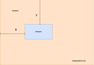
Managing the popover's position and appearance can significantly enhance UX. Use CSS to style the popover content and JavaScript calculations to position it relative to its triggering element. For instance, to display the popover above the trigger element, calculate its size and offset accordingly.
// Example function to position the popover
function positionPopover(triggerElement, popover) {
  const rect = triggerElement.getBoundingClientRect();
  popover.style.left = `${window.scrollX + rect.left}px`;
  popover.style.top = `${window.scrollY + rect.top - popover.offsetHeight}px`;
}

document.getElementById('infoButton').addEventListener('mouseenter', function() {
  const popover = document.getElementById('popoverContent');
  popover.style.display = 'block';
  positionPopover(this, popover);
  this.appendChild(popover);
});
Event-Driven Popovers
Instead of simply hovering, popovers can be triggered by different events, such as clicks. This is crucial for mobile usability, where hover states are less practical.
document.getElementById('infoButton').addEventListener('click', function(evt) {
  evt.stopPropagation();
  const popover = document.getElementById('popoverContent');
  popover.style.display = (popover.style.display === 'block') ? 'none' : 'block';
  if (popover.style.display === 'block') {
    positionPopover(this, popover);
  }
});

document.addEventListener('click', function() {
  const popover = document.getElementById('popoverContent');
  popover.style.display = 'none';
});
Best Practices
When working with popovers, consider some best practices:
- Avoid Overusing Popovers: Too many popovers can distract and overwhelm users.
- Ensure Accessibility: Use ARIA roles and landmarks so that screen readers can interpret them.
- Be Mobile-Friendly: Ensure popovers work well on all devices, adjusting to touch events and screen sizes.
Conclusion
The Popover API is a flexible tool for enhancing user interaction by providing in-situ guidance and information. Used correctly, it enriches the user experience and provides clarity without sacrificing the UI's simplicity. Always account for different user interactions and accessibility while melding this feature into your projects.

