The Visual Viewport API is a crucial tool in modern web development, allowing developers to manage user interactions with zooming and scrolling on their web pages. Understanding how to effectively use this API can lead to an improved user experience, especially on mobile devices where these interactions are prevalent.
The Visual Viewport API gives access to properties that describe the size and position of the viewport in relation to the web content. This is particularly useful for improving accessibility and ensuring that dynamic content is handled gracefully during zooming and scrolling.
Getting Started with the Visual Viewport API
To begin using the Visual Viewport API, check the availability of the API in the current browser since not all browsers may implement this interface. You can do this with a simple conditional check.
if (window.visualViewport) {
  console.log('Visual Viewport API is supported');
} else {
  console.log('Visual Viewport API is not supported');
}
Once confirmed, you can access the main properties of window.visualViewport such as:
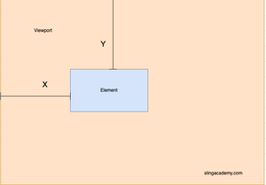
widthandheight: Provide the width and height of the visual viewport.offsetLeftandoffsetTop: Describe the displacement of the visual viewport from the layout viewport, offering insights during pinch gesture interactions.scale: Expresses the zoom scale, useful for understanding the zoom level applied by the user.
Listening to Visual Viewport Changes
Modern web applications often require interactive elements that adapt to viewport changes. You can add event listeners to monitor such changes using the resize and scroll events specific to the Visual Viewport API.
window.visualViewport.addEventListener('resize', () => {
  console.log('Viewport resized');
  console.log(`New width: ${window.visualViewport.width}, New height: ${window.visualViewport.height}`);
});

window.visualViewport.addEventListener('scroll', () => {
  console.log('Viewport scrolled');
  console.log(`New offsetLeft: ${window.visualViewport.offsetLeft}, New offsetTop: ${window.visualViewport.offsetTop}`);
});
These events are fired when the visual viewport changes size or when the user scrolls the content rendered on the screen. With this setup, you can dynamically adjust your content as required.
Practical Use Cases
Imagine an image gallery where users can zoom into images. By implementing the Visual Viewport API, you can ensure that necessities such as UI elements (like navigation buttons) remain easily accessible, regardless of the zooming and scrolling actions taken by the user.
function adjustNavigationButtons() {
  const navButtons = document.querySelectorAll('.nav-button');
  const scale = window.visualViewport.scale;
  navButtons.forEach(button => {
    button.style.transform = `scale(${1 / scale})`;
  });
}

window.visualViewport.addEventListener('resize', adjustNavigationButtons);
window.visualViewport.addEventListener('scroll', adjustNavigationButtons);
This function recalibrates the size of navigation buttons to maintain their perceived size on the screen, further boosting the usability of the application.
Conclusion
The Visual Viewport API provides a responsive toolset for developers aiming to optimize their web applications for mobile and desktop devices. By tapping into its functionalities, developers can create more immersive and adaptable experiences for users, taking into account the pixel density and interaction nuances specific to each device.

