The frosted glass effect (glassmorphism) is a design trend that creates a frosted glass-like appearance on UI elements. It uses blurred, semi-transparent backgrounds with elements that seem to float above them. It can add depth and visual hierarchy to your UI and highlight the content you want to focus on.
In Tailwind CSS, we can add a frosted glass effect to an element by using the backdrop-blur-{amount} utility. Besides, we need to set the background color with an opacity of less than 1. To do so, use bg-{color} and bg-opacity-{amount} classes.
Words might be confusing and boring. Please see the example below for more clarity.
Example
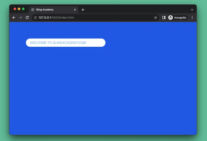
1. Create a plain webpage with an image background:
<body class="bg-cover grid grid-cols-3 gap-4 p-20"
style="background: url(https://www.slingacademy.com/wp-content/uploads/2022/10/green.webp)">
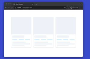
</body>At this point, here’s what we achieved:
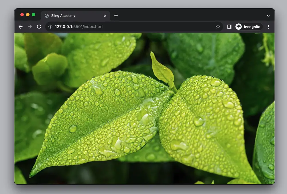
The purpose of using a green photo as a background is for you to see the frosted glass effect more clearly later.
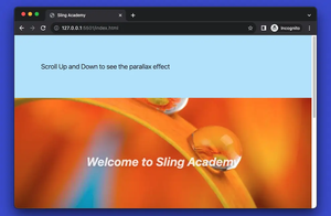
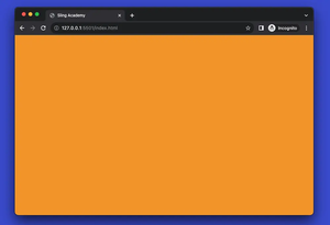
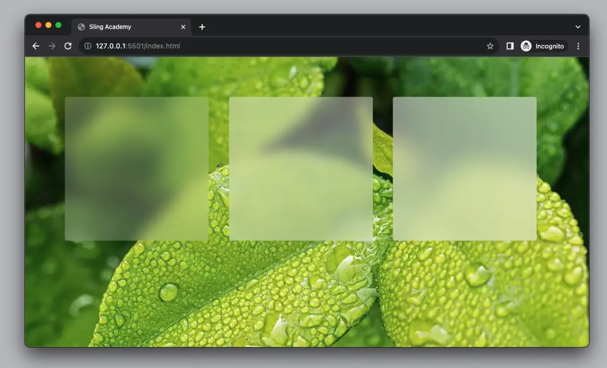
2. Implement three cards that present frosted glass effects:
<body class="bg-cover grid grid-cols-3 gap-4 p-20"
    style="background: url(https://www.slingacademy.com/wp-content/uploads/2022/10/green.webp)">
    <div class="w-72 h-72 bg-white bg-opacity-20 backdrop-blur-lg rounded drop-shadow-lg"></div>
    <div class="w-72 h-72 bg-white bg-opacity-40 backdrop-blur-md rounded drop-shadow-lg"></div>
    <div class="w-72 h-72 bg-white bg-opacity-50 backdrop-blur-xl rounded drop-shadow-lg"></div>
</body>
The final result:
Full source code (including HTML boilerplate):
<!DOCTYPE html>
<html lang="en">

<head>
    <meta charset="UTF-8">
    <meta name="viewport" content="width=device-width, initial-scale=1.0">
    <script src="https://cdn.tailwindcss.com"></script>
    <title>Sling Academy</title>
</head>

<body class="bg-cover grid grid-cols-3 gap-4 p-20"
    style="background: url(https://www.slingacademy.com/wp-content/uploads/2022/10/green.webp)">

    <div class="w-72 h-72 bg-white bg-opacity-20 backdrop-blur-lg rounded drop-shadow-lg"></div>

    <div class="w-72 h-72 bg-white bg-opacity-40 backdrop-blur-md rounded drop-shadow-lg"></div>

    <div class="w-72 h-72 bg-white bg-opacity-50 backdrop-blur-xl rounded drop-shadow-lg"></div>

</body>


</html>
That’s it. Happy coding and let others see your beautiful designs made with Tailwind CSS.