A striped table or a zebra striped table is a table whose odd and even rows have different background colors. This makes it easier for users to read as well as aesthetically pleasing.
This succinct article shows you how to create a striped table with Tailwind CSS. The point here is to use the even and odd modifiers for <tr>, like so:
<tr class="even:bg-amber-100 odd:bg-blue-100">
   <td> ... </td>
</tr>
If you need more clarity and completeness, see the example below.
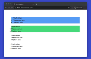
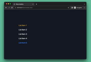
Example
Screenshot:
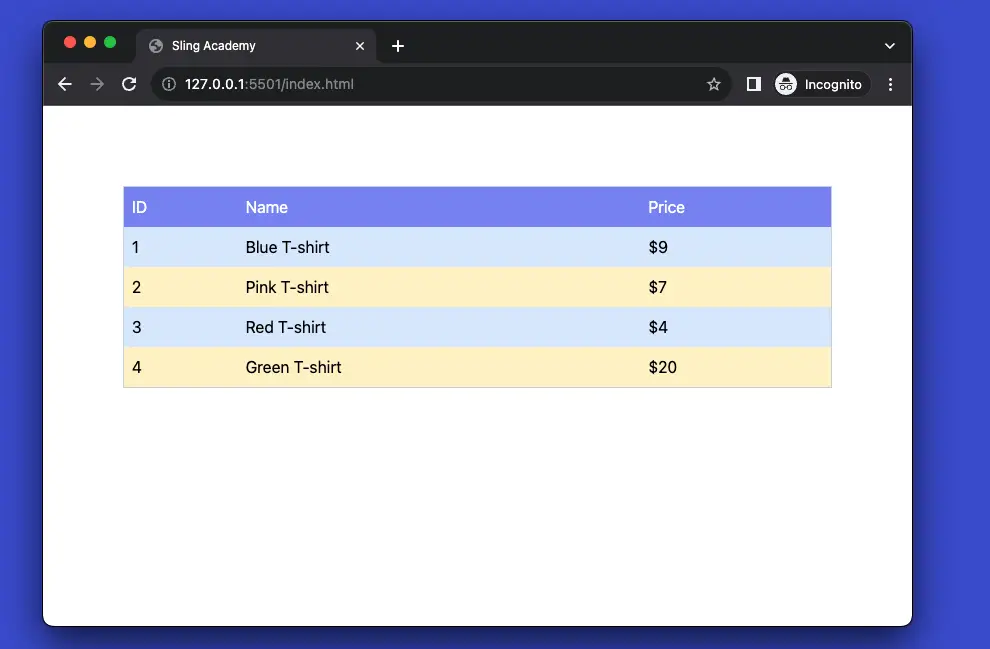
The code:
<body class="p-20">
    <table class="
    table-auto w-full border-collapse border border-slate-300">
        <thead>
            <tr class="bg-indigo-400 text-white">
                <td class="p-2">ID</td>
                <td class="p-2">Name</td>
                <td class="p-2">Price</td>
            </tr>
        </thead>
        <tbody>
            <tr class="even:bg-amber-100 odd:bg-blue-100">
                <td class="p-2">1</td>
                <td class="p-2">Blue T-shirt</td>
                <td class="p-2">$9</td>
            </tr>
            <tr class="even:bg-amber-100 odd:bg-blue-100">
                <td class="p-2">2</td>
                <td class="p-2">Pink T-shirt</td>
                <td class="p-2">$7</td>
            </tr>
            <tr class="even:bg-amber-100 odd:bg-blue-100">
                <td class="p-2">3</td>
                <td class="p-2">Red T-shirt</td>
                <td class="p-2">$4</td>
            </tr>
            <tr class="even:bg-amber-100 odd:bg-blue-100">
                <td class="p-2">4</td>
                <td class="p-2">Green T-shirt</td>
                <td class="p-2">$20</td>
            </tr>
        </tbody>
    </table>
</body>
Code explained:
- The
<body>element has a class ofp-20, which adds a padding of 20 units around the content. - The
<table>element has classes oftable-auto,w-full,border-collapse,border, andborder-slate-300, which makes the table responsive, full-width, with collapsed borders and a slate color. - The
<thead>element contains the table header, which has a row (<tr>) with three cells (<td>). The row has classes ofbg-indigo-400andtext-white, which makes the background indigo and the text white. The cells have a class ofp-2, which adds a padding of 2 units around the content. - The
<tbody>element contains the table body, which has four rows with three cells each. The rows have classes ofeven:bg-amber-100andodd:bg-blue-100, which makes the even rows amber and the odd rows blue. The cells have the same class ofp-2as the header cells.