Next.js is a React framework that is used to build fast, high-performance, hybrid static and server-side rendering web applications.
Ant Design is a UI library that provides a lot of pre-made React components like Button, DatePicker, DropDown, Drawer, etc., which can help you create beautiful and enterprise-class products.
In this article, you will learn how to use Ant Design in a Next.js project.
Basic Setup
1. Open your terminal window and navigate to the place you want your Next.js project to locate, then run the following command:
npx create-next-app exampleThe name is totally up to you.
2. Navigate to the project root folder:
cd example3. Install the Ant Design core and its icon set by executing the command below:
npm install antd @ant-design/icons --save4. Now you can use the components and icons you like by importing them from antd and @ant-design/icons, respectively, like this:
import { Button, Space, DatePicker, Card } from 'antd';
import { SearchOutlined } from '@ant-design/icons';
Note that you can find all available icons provided by Ant Design at /node_modules/@ant-design/icons/lib/icons/index.d.ts.
Example
Replace the default code in your pages/index.js with the following:
import { Button, Space, DatePicker, Card } from 'antd';
import { SearchOutlined } from '@ant-design/icons';

export default function Home() {
  const onChange = () => {};
  return (
    <div style={{ padding: 100 }}>
      <Space direction="vertical">
        <Button type="primary">Primary Button</Button>
        <Button type="ghost">Ghost Button</Button>
        <DatePicker onChange={onChange} />
        <SearchOutlined style={{fontSize: 60, color: 'green'}} />
        <Card>
          <p>Card content</p>
        </Card>
      </Space>
    </div>
  );
}
Get your app up and running by executing the following command:
npm run devGo to http://localhost:3000 on your web browser and check the result:
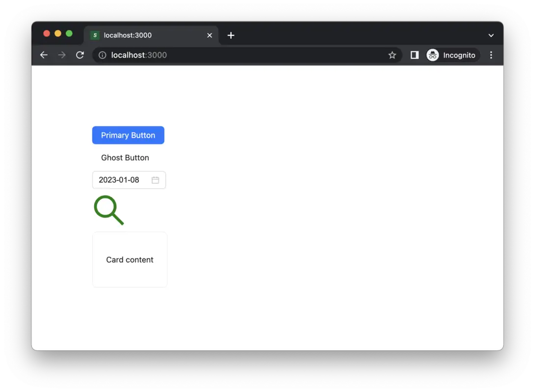
That’s it. Happy coding!
