Introduction
Data visualization is an essential skill in the toolbox of data analysts, scientists, and anyone trying to make sense of datasets. With Python at the forefront of data science, libraries like Matplotlib and NumPy form the backbone of data visualization tasks. In this tutorial, we dive into the basics and then explore more advanced techniques to visualize data using Matplotlib and NumPy.
Getting Things Ready
Firstly, ensure you have Python installed on your machine. Install Matplotlib and NumPy by using pip:
pip install matplotlib numpyWith the installation out of the way, let’s start plotting.
Basic Plotting
Begin by importing the necessary libraries and plotting a simple line chart:
import matplotlib.pyplot as plt
import numpy as np

# Generate a sequence of numbers
x = np.linspace(0, 10, 100)
# Calculate the sine of each number
y = np.sin(x)

# Plot the data
plt.plot(x, y)

# Display the plot
plt.show()
Screenshot:
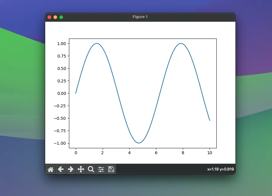
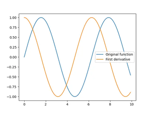
Running this code yields a sinewave plot, introducing you to the fundamental plotting technique.
Customizing the Plot
To customize your plot, let’s change the line color, style, and add labels and a title:
import matplotlib.pyplot as plt
import numpy as np

# Generate a sequence of numbers
x = np.linspace(0, 10, 100)
# Calculate the sine of each number
y = np.sin(x)

plt.plot(x, y, color="green", linestyle="--")
plt.xlabel("X Axis Label")
plt.ylabel("Y Axis Label")
plt.title("Title of The Plot")
plt.show()
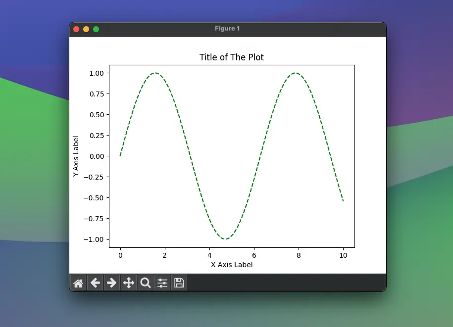
The plot now has a dashed green line, along with labels and a title, as shown in the screenshot below:
Subplots and Multiple Lines
To compare different datasets, you might want to plot them on the same axes or in different subplots. Here’s how:
import matplotlib.pyplot as plt
import numpy as np

# Generate a sequence of numbers
x = np.linspace(0, 10, 100)
# Calculate the sine of each number
y = np.sin(x)

# Create more data
y2 = np.cos(x)

# Plot both sets of data on the same axes
plt.plot(x, y, label="Sine")
plt.plot(x, y2, label="Cosine")

# Add a legend
plt.legend()

# Show the plot
plt.show()
Screenshot:
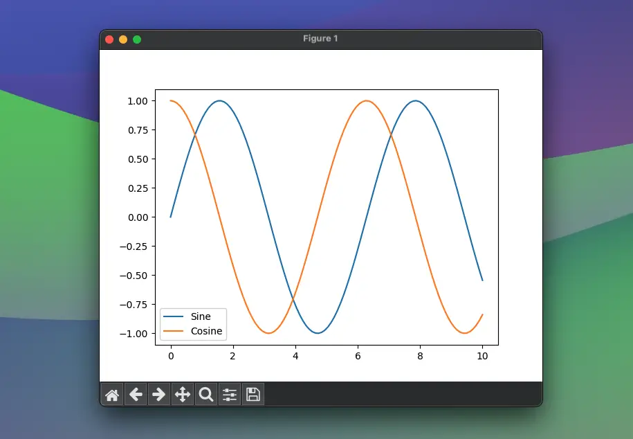
A subplot with its own axes can be created by using plt.subplot():
import matplotlib.pyplot as plt
import numpy as np
# Generate a sequence of numbers
x = np.linspace(0, 10, 100)
# Calculate the sine of each number
y = np.sin(x)
# Create more data
y2 = np.cos(x)
# First subplot
plt.subplot(2, 1, 1) # (rows, columns, panel number)
plt.plot(x, y, color='blue')
plt.title('Sine')
# Second subplot
plt.subplot(2, 1, 2)
plt.plot(x, y2, color='red')
plt.title('Cosine')
# Display the subplots
plt.tight_layout()
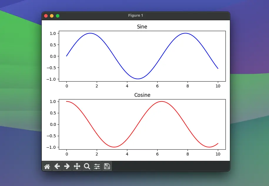
plt.show()This creates two separate plots for the sine and cosine functions:
Scatter Plots and Bar Charts
While line charts are great for time series and continuous data, scatter plots and bar charts serve their purpose for categorical and discrete data analysis.
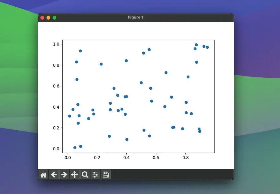
For a scatter plot:
import matplotlib.pyplot as plt
import numpy as np

# Random scatter data
x = np.random.rand(50)
y = np.random.rand(50)

plt.scatter(x, y)
plt.show()

# Show the plot
plt.show()
Screenshot:
To create a bar chart:
import matplotlib.pyplot as plt
import numpy as np

# Categories
categories = ["Category 1", "Category 2", "Category 3"]
# Values
values = [10, 20, 15]

plt.bar(categories, values)
plt.show()
Screenshot:
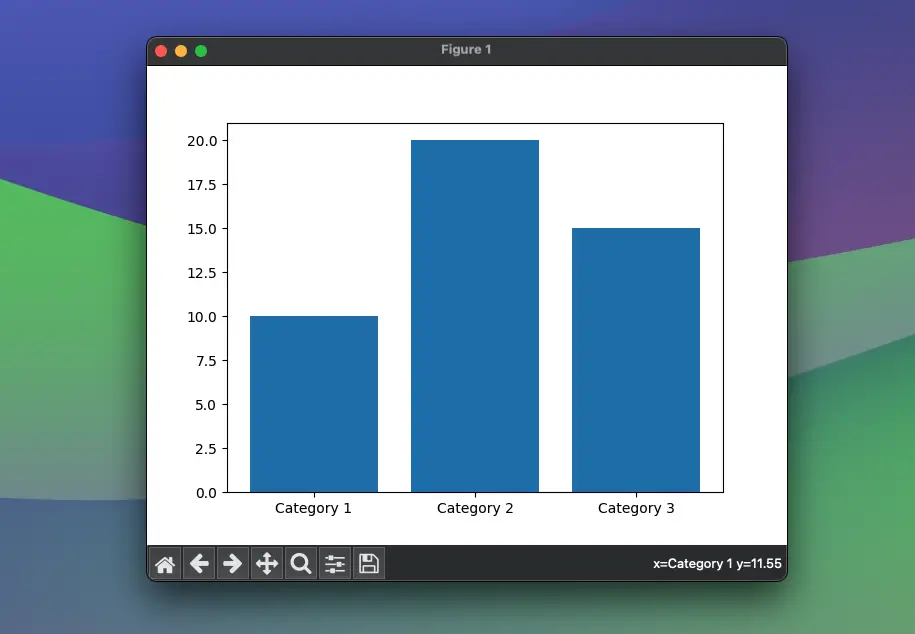
We’ve now depicted data points and groups with scatter plots and bar charts respectively.
Histograms and Boxplots
Histograms give an overview of the distribution of a dataset, while boxplots show quartiles (and potentially outliers).
import matplotlib.pyplot as plt
import numpy as np

# Create a normally-distributed dataset
np.random.seed(0)
data = np.random.randn(1000)

# Histogram
plt.hist(data, bins=30)
plt.show()

# Boxplot
plt.boxplot(data, vert=False)
plt.show()
Screenshot:
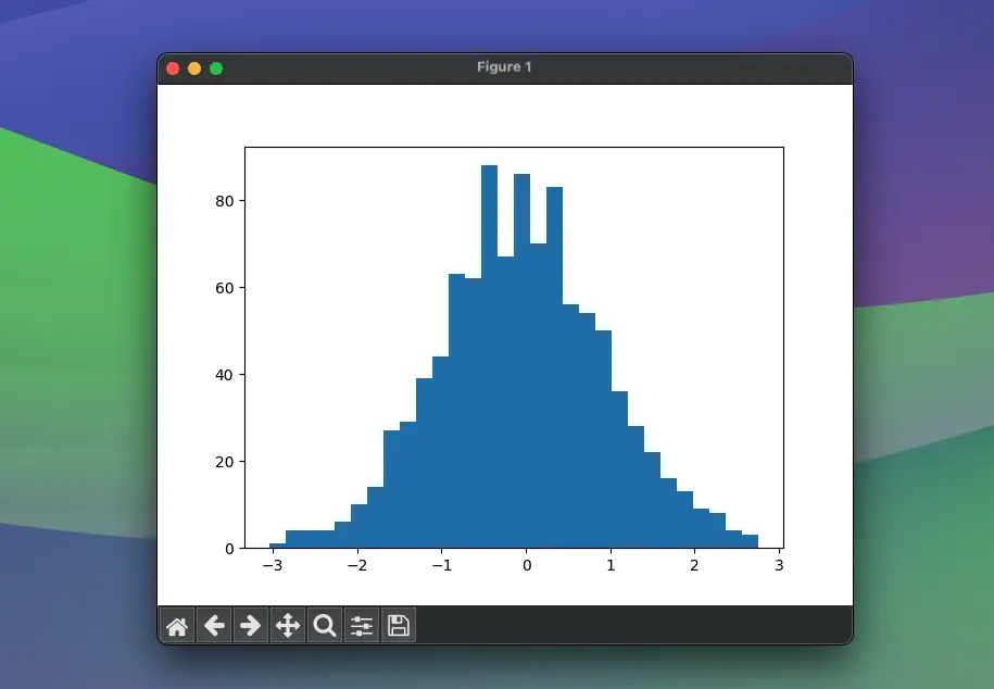
These graphs allow for quick insights into the data’s distribution and variability.
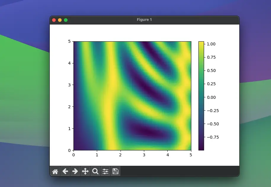
Advanced Plotting: Heatmaps and Contour Plots
For more complex data visualization, such as representing three-dimensional data on a two-dimensional plot, heatmaps and contour plots are invaluable.
Let’s generate a heatmap:
import matplotlib.pyplot as plt
import numpy as np

# Generating 2D data
x = np.linspace(0, 5, 100)
y = np.linspace(0, 5, 100)
X, Y = np.meshgrid(x, y)
Z = np.sin(X) ** 10 + np.cos(10 + Y * X) * np.cos(X)

# Create a heatmap
plt.imshow(Z, extent=[0, 5, 0, 5], origin="lower", cmap="viridis", aspect="auto")
plt.colorbar()
plt.show()
Screenshot:
For a contour plot:
plt.contour(X, Y, Z, colors='black')
plt.show()
Screenshot:
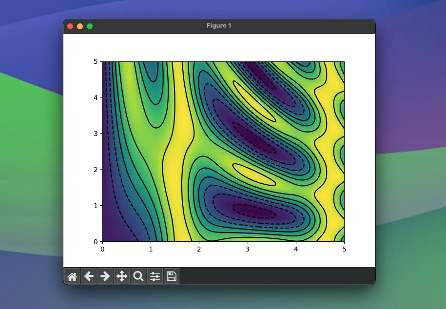
This portrays the topography of the Z function appears as contour lines.
Conclusion
This comprehensive guide has introduced you to different types of plots and their respective customizations in Matplotlib, supplemented by data manipulation using NumPy. We touched upon the basic plots, multi-line and sub-plots, specialized charts like histograms and boxplots, and dived into more complex heatmaps and contour plots. Each visualization serves a unique purpose, allowing you to accurately represent your data and unearth hidden insights.
All these tools let you paint a bigger picture, taking raw data and sculpting it into a story that can be understood at a glance.