As mobile browsing continues to dominate internet usage, optimizing layouts for mobile devices is more important than ever. One powerful yet often underutilized tool at developers' disposal is the Visual Viewport API. This API allows us to adjust layouts based on the actual visual viewport—a flexible portion of the viewport that a user can view and interact with—providing a more accurate representation than the conventional layout viewport.
Understanding the Visual Viewport API
The Visual Viewport API provides properties to access the dimensions and scale of the visual viewport. It offers better insights compared to just using window.innerWidth and window.innerHeight by considering zoom and on-screen keyboards.
Key Properties
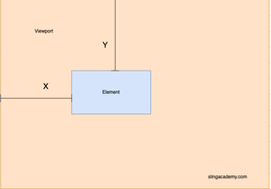
window.visualViewport.width: Represents the width of the visual viewport in CSS pixels.window.visualViewport.height: Indicates the height of the visual viewport in CSS pixels.window.visualViewport.scale: Provides the current scale factor of the viewport.window.visualViewport.offsetLeftandoffsetTop: Provide the amount of content currently scrolled horizontally and vertically.
Using the API for Responsive Layouts
With these properties, you can adjust your layout dynamically based on viewport changes including zoom levels and inconsistent viewport sizes caused by virtual keyboards. Let's dive into a few practical examples to illustrate this process.
Example: Detecting Viewport Resizes
window.visualViewport.addEventListener('resize', () => {
  console.log('Viewport width:', window.visualViewport.width);
  console.log('Viewport height:', window.visualViewport.height);
  console.log('Viewport scale:', window.visualViewport.scale);
});
This simple event listener responds whenever the viewport resizes, logging new dimensions and the scale factor. Real-time updates enable visual adjustments as conditions change through zooming or device rotation.
Example: Adapting Layout on Visual Viewport Resize
window.visualViewport.addEventListener('resize', () => {
  const element = document.querySelector('.responsive-element');
  if (window.visualViewport.scale > 1) {
    element.style.fontSize = '1.5em';
  } else {
    element.style.fontSize = '1em';
  }
});
In this example, the font size of a particular element scales with the viewport. Increasing the scale improves readability when zoomed in—a significant usability enhancement for mobile usability.
Handling Virtual Keyboards
One of the most practical applications of the Visual Viewport API is managing virtual keyboards that often overlap critical UI elements, making them hard to access. By observing visual viewport changes, developers can reposition elements to maintain visibility.
window.visualViewport.addEventListener('resize', () => {
  const inputField = document.querySelector('.input-field');
  const footer = document.querySelector('.footer-nav');

  if (window.visualViewport.height < innerHeight) { // If keyboard is open
    footer.style.display = 'none';
  } else {
    footer.style.display = 'block';
  }
});
Here, the footer navigation is automatically hidden when a keyboard is detected (based on height changes), providing a clear user focus on the input field without obstruction.
Conclusion
The Visual Viewport API enables precise adjustments to mobile layouts, accommodating zoom and virtual keyboard interactions efficiently. Its integration into your projects allows for a more engaging and accessible user experience, essential for responsive modern web applications. Start experimenting with these examples in your mobile web development to harness the full potential of this powerful API.

