In this tutorial, we will delve into the powerful world of hierarchical clustering visualizations using the dendrogram() function from the SciPy library. Hierarchical clustering is a mainstay in data analysis, providing a means to group similar data points based on their characteristics in a tree-like structure. This guide explores how to use the cluster.hierarchy.dendrogram() function in SciPy, demonstrated through three progressively complex examples.
What is Hierarchical Clustering?
Hierarchical clustering is a strategy for data analysis where you build clusters of data points that are meritoriously similar. These clusters are organized as a tree, often visualized with a dendrogram, which shows how each cluster is composed. SciPy, a significant library in the Python ecosystem for scientific computing, offers robust functions to perform hierarchical clustering and visualize it using dendrograms.
Basic Example: Creating a Simple Dendrogram
For our first example, we will start with a straightforward case of visualizing a small dataset. The goal here is to understand how to generate and visualize a dendrogram from scratch.
import matplotlib.pyplot as plt
from scipy.cluster.hierarchy import dendrogram, linkage

# Sample data
X = [[i] for i in range(10)]
Z = linkage(X, 'single')

plt.figure(figsize=(10, 7))
dendrogram(Z)
plt.title('Simple Dendrogram')
plt.xlabel('Data Points')
plt.ylabel('Distance')
plt.show()
Output:
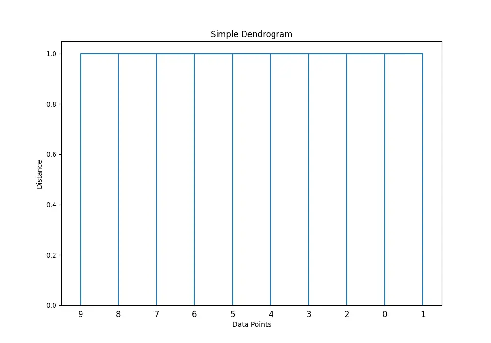
In this example, we start by importing necessary libraries and defining a simple dataset X. We then use linkage to perform hierarchical clustering and dendrogram to visualize the results. The result is a simple dendrogram showcasing the hierarchical structure of our data.
Intermediate Example: Customizing Dendrogram Appearance
Next, let’s see how to customize our dendrogram to make it more informative and visually appealing. This involves adjusting labels, colors, and thresholds.
import numpy as np
import matplotlib.pyplot as plt
from scipy.cluster.hierarchy import dendrogram, linkage

# Creating a more complex dataset
X = np.random.multivariate_normal([10, 20], [[3, 1], [1, 4]], size=50)
Z = linkage(X, 'ward')

plt.figure(figsize=(12, 8))
dendrogram(Z,
           orientation='right',
           labels=[f'Point {i}' for i in range(50)],
           color_threshold=0.1 * max(Z[:, 2]),
           above_threshold_color='grey')
plt.title('Customized Dendrogram')
plt.xlabel('Distance')
plt.show()
Output:
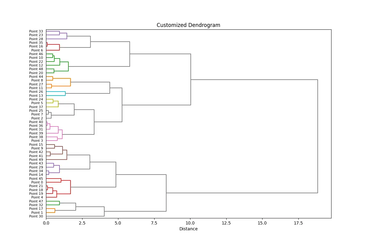
In this intermediate example, we designed a dendrogram with custom labels, orientations, and color schemes. Note how setting the color_threshold and above_threshold_color changes the dendrogram’s visual representation of cluster formation, making it easier to interpret.
Advanced Example: Integrating Dendrogram with Heatmap
For a more advanced application, we will integrate our dendrogram with a heatmap to visualize not just the hierarchical structure but also the underlying data. This is particularly useful for analyzing gene expression data, market research data, etc.
import seaborn as sns

# Generate synthetic data that's typically used for heatmaps
data = np.random.rand(10, 12)
sns.clustermap(data, figsize=(12, 8), method='ward', cmap='viridis',
               col_cluster=False, row_linkage=Z)
plt.title('Dendrogram with Heatmap', pad=90)
plt.show()
In this sophisticated example, we leverage seaborn‘s clustermap function, which creates a heatmap and overlays a dendrogram. We disabled column clustering to focus on the row linkage provided by our previous clustering. The result is a rich visual representation combining the hierarchical clustering analysis with actual data insights.
Conclusion
The dendrogram() function in SciPy’s cluster.hierarchy toolkit is a versatile tool for hierarchical clustering visualization. Through this tutorial, we demonstrated its capabilities with simple to complex examples, showcasing not just clustering, but also methods to enhance our dendrogram visualizations. By mastering dendrogram customization and integration with other data visualization techniques, such as heatmaps, researchers and analysts can glean deeper insights into their data, making the dendrogram() function an invaluable asset in the data science toolkit.