The Popover API in JavaScript is a modern approach to creating contextual overlays that enhance user experience without cluttering the interface. These overlays, also known as popovers, allow developers to show additional information when users interact with certain elements, such as buttons or links.
Understanding the Popover API
The Popover API is a part of HTML's standard toolset designed to help programmers attach custom overlays to HTML elements. This API leverages JavaScript for dynamic content management, supporting straightforward operations like showing and hiding popovers programmatically. Compared to traditional methods of HTML/CSS overlays, the Popover API offers better performance and more consistent behavior across different browsers.
Basic Structure of a Popover
At its core, a popover consists of an HTML element that serves as the trigger and another element that defines the popover content. Here’s a basic example:
<button id="infoButton">More Info</button>
<div id="infoPopover">
  <p>This is the popover content.</p>
</div>
Implementing Popover API
To leverage the Popover API, you need to initiate it using JavaScript. Let’s demonstrate how this can be done:
document.addEventListener('DOMContentLoaded', (event) => {
  const button = document.getElementById('infoButton');
  const popover = document.getElementById('infoPopover');

  button.addEventListener('click', (event) => {
    popover.togglePopover();
  });
});
In the above JavaScript snippet, we attach an event listener to the button. When the button is clicked, the .togglePopover() method is called on the popover, which is a hypothetical method in this example used to portray the API's working.
Advanced Features
The API offers advanced attributes and methods, such as anchors and directionality settings. These features are essential in optimizing user interactions and positioning the popover appropriately.
Positioning Popovers
Positioning is critical, especially for responsive design. Let’s examine how directionality can be controlled:
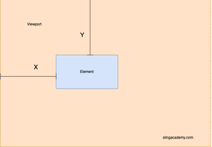
popover.showPopover({
  anchorNode: button,
  placement: 'bottom'
});
This instructs the popover to display at the bottom of the <button> that triggers the event.
Auto-hide Popovers
To enhance UX, implement auto-hide functionality. Here's how:
function autoHide(category) {
  window.addEventListener('click', (event) => {
    if (event.target !== category && !category.contains(event.target)) {
      const popover = document.getElementById('infoPopover');
      if (!popover.matches(':hover')) {
        popover.hidePopover();
      }
    }
  });
}
autoHide(button);
This code detects clicks outside the popover to hide it, preventing clutter.
Considerations and Best Practices
When deploying the Popover API, ensure accessibility and responsiveness. Popovers should not impede navigation. Visually impaired users can benefit from ARIA attributes, enhancing information presentation. Test popovers across various devices to maintain consistent user experiences.
Usage of this API represents modernization in web design, offering a more seamless and efficient way of managing small chunks of data relevant to user's actions.
With the Popover API, web applications can present information in a way that's both user-friendly and aesthetically pleasing, respecting the requirements of both novice and experienced developers.

