Introduction
When developing responsive web applications, keeping the content in sync with viewport changes is crucial. This is particularly significant for browsers on touchscreen devices where users commonly zoom in and out of web pages. In this article, we will explore how to synchronize content position with visual viewport changes using JavaScript.
Understanding the Visual Viewport API
The Visual Viewport API provides web developers with a way to access information about the visible portion of the screen. This API is useful for handling events related to changes in the user’s view, such as zooming or scrolling.
window.visualViewport.addEventListener('resize', function(event) {
    // Callback function when viewport resizes
    console.log('Viewport resized, width: ', window.visualViewport.width);
});
The above code snippet utilizes the visualViewport property of the window object, binding an event listener to the resize event.
Syncing Content with Viewport
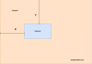
To maintain the user interface consistency when the viewport changes, you can adjust the layout by calculating offsets and transforming elements accordingly. Consider the sample code below:
function syncContent() {
    const content = document.getElementById('content');
    const offsetX = window.visualViewport.offsetLeft;
    const offsetY = window.visualViewport.offsetTop;
    content.style.transform = `translate(${-offsetX}px, ${-offsetY}px)`;
}

window.visualViewport.addEventListener('scroll', syncContent);
window.visualViewport.addEventListener('resize', syncContent);
This code aids in positioning the content correctly whenever the viewport is scrolled or resized. By applying a transform based on offsets, your content maintains sync with the view changes.
Considerations and Limitations
Although the Visual Viewport API is indispensable for responsive design, developers should remember browser compatibility and potential fallbacks for browsers that do not support this API.
if (!window.visualViewport) {
    console.warn('Visual Viewport API is not supported on this browser.');
}
It's recommended to test the implementation across multiple devices to ensure consistent behavior. Also, be mindful of performance implications as frequent DOM manipulations based on viewport changes may affect performance.
Conclusion
Keeping the content aligned with visual viewport changes can significantly enhance user experience. With modern APIs such as the Visual Viewport API, developers have powerful tools at their disposal to manage view changes efficiently. Implementing these strategies will lead to more robust, user-friendly web applications.
By mastering these techniques, developers can create applications that not only look great regardless of the device being used but also deliver smooth and responsive interactions that today's users expect.


