An image overlay effect is a technique of creating an additional layer on top of an image, usually for aesthetic or functional purposes. For example, you can use an image overlay to add text, an icon, or another image on top of the original image, or to change the appearance or opacity of the image.
This succinct, example-based article shows you how to create image hover overlay effects with Tailwind CSS.
Example
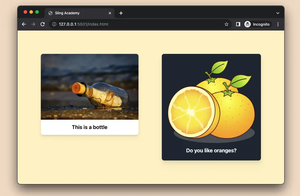
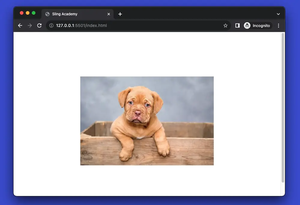
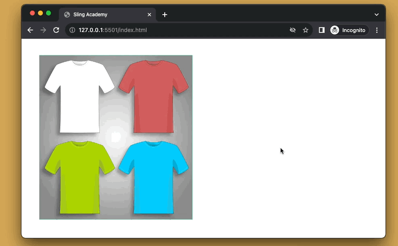
The GIF below depicts what we’re going to make. When we hover over the image, a curtain with a button inside will animate down. The opacity of the overlay increases from zero to non-transparent, too.
The code:
<body class="p-10">
    <div class="group relative w-96">
        <img class="w-full object-cover" src="https://www.slingacademy.com/wp-content/uploads/2022/10/example.png" />
        <div
            class="absolute top-0 left-0 w-full h-0 flex flex-col justify-center items-center bg-indigo-700 opacity-0 group-hover:h-full group-hover:opacity-100 duration-500">
            <h1 class="text-2xl text-white">Fiction T-Shirt Store</h1>
            <a class="mt-5 px-8 py-3 rounded-full bg-amber-400 hover:bg-amber-600 duration-300" href="#">Continue
                Shopping</a>
        </div>
    </div>
</body>
Explanation
In the beginning, the opacity of the overlay is zero (with the opacity-0 utility) and its height is zero, too (with the h-0 utility).
When the parent div is hovering, the opacity of the overlay changes to 100% (opacity-100), and its height increases to 100% of its parent’s height (w-full).
The point is we use the group class and the group-* modifier to style the overlay based on the parent div state:
<div class="group">
  <img src="" />
  <div class="opacity-0 h-0 group-hover:opacity-100 group-hover:h-full">
     This Is The Overlay
  </div>
</div>
This tutorial ends here. Happy coding & see you again in other articles.