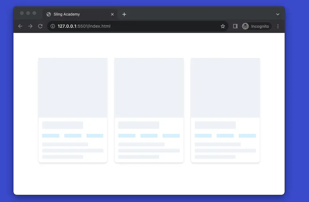
Shimmer loading placeholders are animated placeholders that simulate the layout of a website while data is being loaded. They create a sense of depth and immersion in the website and improve the perceived performance and user experience. They are also known as content loaders, skeleton screens, or ghost elements.
The example below shows you how to create skeleton loading placeholders with Tailwind CSS. The main point here is to use the animate-pulse utility class to make things shimmer.
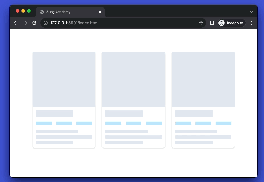
Example Preview:
Note that the actual result will look better than what you see in the GIF above (I have to compressed it to reduce the size from MBs to Kbs).
The code:
<body class="p-20">
    <div class="grid sm:grid-cols-2 md:grid-cols-3 lg:grid-cols-4 gap-6">
        <div class="w-full bg-white drop-shadow-md rounded-lg">
            <div class="animate-pulse w-full h-48 bg-slate-200"></div>
            <div class="p-3 space-y-4">
                <div class="animate-pulse w-2/3 h-6 bg-slate-200"></div>
                <div class="flex space-x-4">
                    <div class="animate-pulse w-1/3 h-3 bg-sky-200"></div>
                    <div class="animate-pulse w-1/3 h-3 bg-sky-200"></div>
                    <div class="animate-pulse w-1/3 h-3 bg-sky-200"></div>
                </div>
                <div class="space-y-2">
                    <div class="animate-pulse w-3/4 h-3 bg-slate-200"></div>
                    <div class="animate-pulse w-full h-3 bg-slate-200"></div>
                    <div class="animate-pulse w-2/3 h-3 bg-slate-200"></div>
                </div>
            </div>
        </div>
    </div>
</body>
Code explained
- The code uses
grid,sm:grid-cols-2,md:grid-cols-3,lg:grid-cols-4, andgap-6classes to create a grid layout with four columns and a gap of 6 units. - Each column has a
divwith a white background, a drop shadow, and rounded corners. The first child is an image placeholder with a fixed height, a gray background, and a cover and center style. The second child is a text placeholder with a padding and a vertical space. - The text placeholder has a heading placeholder, a rating placeholder, and a paragraph placeholder. The heading placeholder has a width of 2/3, a height of 6 units, and a gray background. The rating placeholder has a flex layout and a horizontal space. It contains three stars with a width of 1/3, a height of 3 units, and a light blue background. The paragraph placeholder has a vertical space. It contains three sentences with a height of 3 units and a gray background. The sentences have different widths of 3/4, full, and 2/3.
- All the placeholder elements have the
animate-pulseclass, which applies a pulsing animation to the background color. This class is from Tailwind CSS, a CSS framework that provides many utility classes for web design.