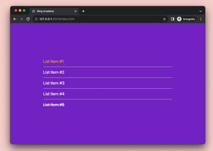
In Tailwind CSS, we can use flex or grid utility class to create a layout with multiple columns sitting side by side (on the same rows) and all of the columns are equal in height.
Example
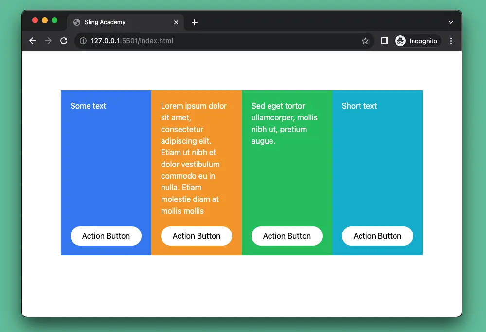
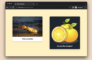
Screenshot:
This code produces the result above (the parent element has the flex utility class):
<body>
    <div class="flex m-20">
        <div class="w-1/4 bg-blue-500 p-5 flex flex-col">
            <div class="text-white flex-1">
                Some text
            </div>
            <button class="bg-white rounded-full mt-5 px-5 py-2">Action Button</button>
        </div>
        <div class="w-1/4 bg-amber-500 p-5 flex flex-col">
            <div class="text-white flex-1">
                Lorem ipsum dolor sit amet, consectetur adipiscing elit. Etiam ut nibh et dolor vestibulum commodo eu in
                nulla. Etiam molestie diam at mollis mollis
            </div>
            <button class="bg-white rounded-full mt-5 px-5 py-2">Action Button</button>
        </div>
        <div class="w-1/4 bg-green-500 p-5 flex flex-col">
            <div class="text-white flex-1">
                Sed eget tortor ullamcorper, mollis nibh ut, pretium augue.
            </div>
            <button class="bg-white rounded-full mt-5 px-5 py-2">Action Button</button>
        </div>
        <div class="w-1/4 bg-cyan-500 p-5 flex flex-col">
            <div class="text-white flex-1">
                Short text
            </div>
            <button class="bg-white rounded-full mt-5 px-5 py-2">Action Button</button>
        </div>

    </div>
</body>
You can achieve the same thing like so (the parent element makes use of the grid utility class):
<body>
    <div class="grid grid-cols-4 gap-4 m-20">
        <div class="bg-blue-500 p-5 flex flex-col">
            <div class="text-white flex-1">
                Some text
            </div>
            <button class="bg-white rounded-full mt-5 px-5 py-2">Action Button</button>
        </div>
        <div class="bg-amber-500 p-5 flex flex-col">
            <div class="text-white flex-1">
                Lorem ipsum dolor sit amet, consectetur adipiscing elit. Etiam ut nibh et dolor vestibulum commodo eu in
                nulla. Etiam molestie diam at mollis mollis
            </div>
            <button class="bg-white rounded-full mt-5 px-5 py-2">Action Button</button>
        </div>
        <div class="bg-green-500 p-5 flex flex-col">
            <div class="text-white flex-1">
                Sed eget tortor ullamcorper, mollis nibh ut, pretium augue.
            </div>
            <button class="bg-white rounded-full mt-5 px-5 py-2">Action Button</button>
        </div>
        <div class="bg-cyan-500 p-5 flex flex-col">
            <div class="text-white flex-1">
                Short text
            </div>
            <button class="bg-white rounded-full mt-5 px-5 py-2">Action Button</button>
        </div>

    </div>
</body>
That’s it. Happy coding & have a great day!