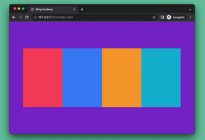
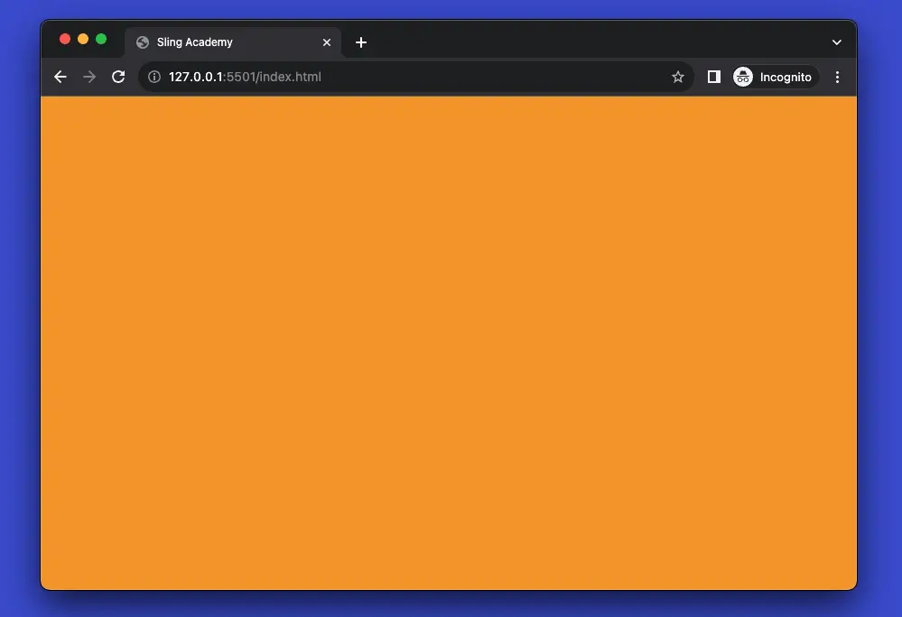
In Tailwind CSS, you can make a div element fill the width and height of the viewport by using the w-screen and h-screen utilities, respectively. This is equivalent to setting the width and height of the div element to 100vw and 100vh in pure CSS.
Example:
<!doctype html>
<html>

<head>
    <meta charset="UTF-8">
    <meta name="viewport" content="width=device-width, initial-scale=1.0">
    <script src="https://cdn.tailwindcss.com"></script>
    <title>Sling Academy</title>
</head>

<body>
    <div class="w-screen h-screen bg-amber-500"></div>
</body>

</html>
Screenshot:
That’s it. Happy coding & have a nice day!