In Tailwind CSS, you can style the placeholder text of an input field (or textarea) by using the placeholder modifier (a modifier is a prefix word that can be added to the beginning of a utility class) in combination with text utility classes, such as placeholder:text-2xl, placeholder:text-red-500, placeholder:semibold, etc.
Example:
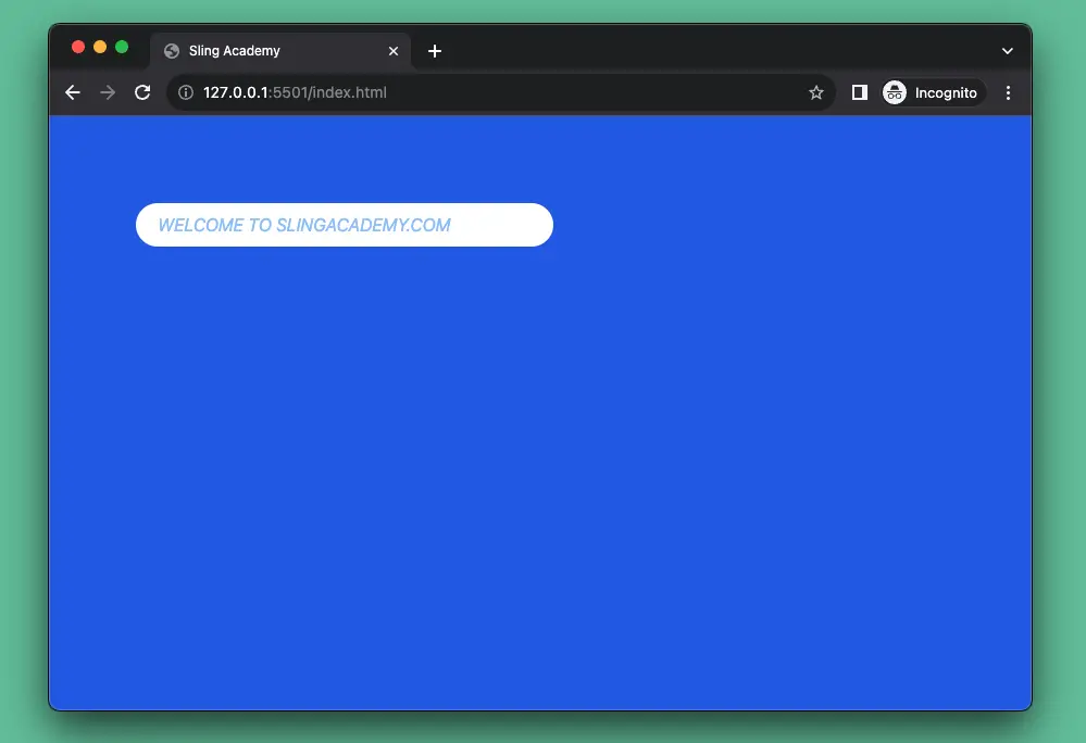
The code:
<body>
    <div class="w-screen h-screen p-20 bg-blue-600">
        <input
            class="placeholder:text-blue-300 placeholder:italic placeholder:uppercase w-96 px-5 py-2 rounded-full outline-none"
            placeholder="Welcome to SlingAcademy.com" />
    </div>
</body>
That’s it. Happy coding & have a nice day!