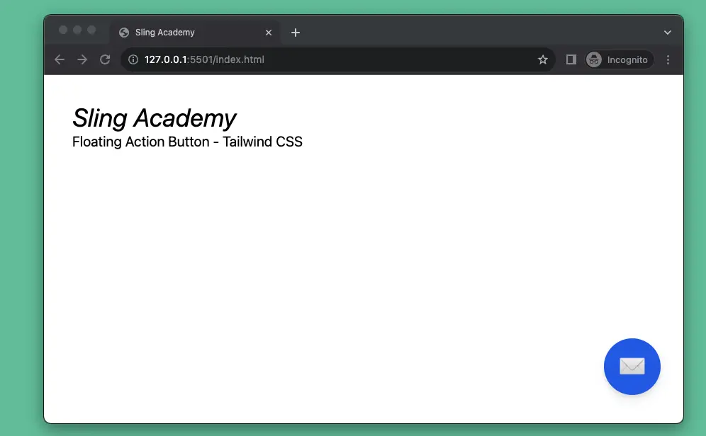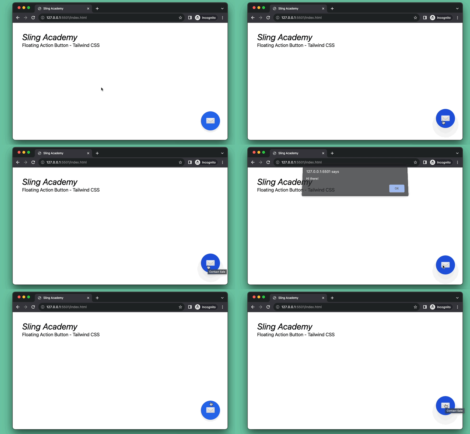
A floating action button (FAB) is usually located in the lower right or left corner of the screen. It has a fixed position and has a larger z-index than other elements of the web page. Therefore, the floating action button always stands out and will be noticed by users more. It is often used to open chat dialogs, contact support, or other important actions, depending on the purpose of each website.
The example below shows you how to create a floating action button with Tailwind CSS.
Preview:

The code:
<body>
<!-- Dummy content -->
<div class="p-10">
<h1 class="text-4xl italic">KindaCode.com</h1>
<h3 class="text-xl">Some content here</h3>
</div>
<!-- Implement the FAB -->
<button onclick="buttonHandler()" title="Contact Sale"
class="fixed z-90 bottom-10 right-8 bg-blue-600 w-20 h-20 rounded-full drop-shadow-lg flex justify-center items-center text-white text-4xl hover:bg-blue-700 hover:drop-shadow-2xl hover:animate-bounce duration-300">✉</button>
<!-- Javascript code -->
<script>
// Do something when the button is clicked
function buttonHandler() {
alert('Hi there!');
}
</script>
</body>Code explained:
- The
onclickattribute specifies a JavaScript function to be executed when the button is clicked. In this case, the function isbuttonHandler(). - The
titleattribute specifies a text to be displayed when the user hovers over the button. In this case, the text isContact Sale. - We use several Tailwind CSS utility classes to style the button:
fixed: This class makes the button positioned fixed to the viewport, meaning that it stays in the same place even if the page is scrolled.z-90: This class sets a very high z-index for the button, making it stand in front of other page elements.bottom-10,right-8,w-20,h-20: Set the position and the size of the button.
✉: This helps us display an HTML envelop symbol. No need to use an icon or an image here.